
2024 Recap:

.
I always make plans that are way too big for practicality, so I’ve done a lot of thinking and planning to try to keep my aspirations grounded in reality. I feel like I didn’t do a lot of crafting in 2024, but then I remember the prom dresses and the Layer Cake Latte quilt and the Baking Doodle Cowl and I feel stressed out all over again by it all, ha ha. I really hit the ground running hard at the beginning of last year, didn’t I? That was pretty intense. No wonder I took the remainder of the year off!
.

.

.
I was busy in the garden all summer, and did it ever reward us with a delightful crop! I’m so proud of the garden this last year, it was great!
And then autumn came, and with it a whole lot of difficulties. Thankfully, two of those hardships now mean that I’m stronger and more available to do crafty things in my free time. Yay!
Something will need to change in regards to the Christmas season next time ’round, though. I’m drowning every year and family members were complaining this year as well. It’s hard to step back from doing good things, but I think we’ve officially reached the point where we’re doing too many good things and need to cut back.
Looking Ahead in 2025
I have a Fat Quarter Shop quilt a-brewing in the background right now, so that’s fun.
I’m trying to declutter my craft room because it’s officially too full of junk to be enjoyable to work in. I had an epiphany regarding my quilting stash the other day as I was decluttering, and I’m hoping that it will lead to more quilts made from my scrap stash in the future!
Plans for Winter Quarter 2025 thus far:
.
- Fabric:
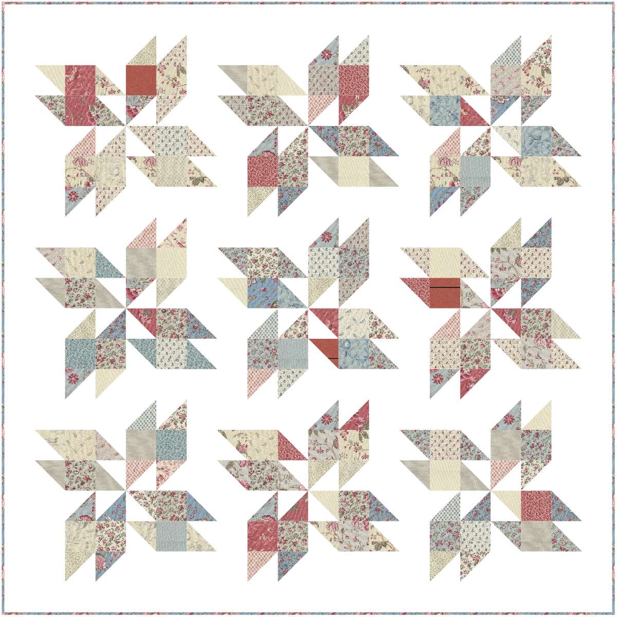
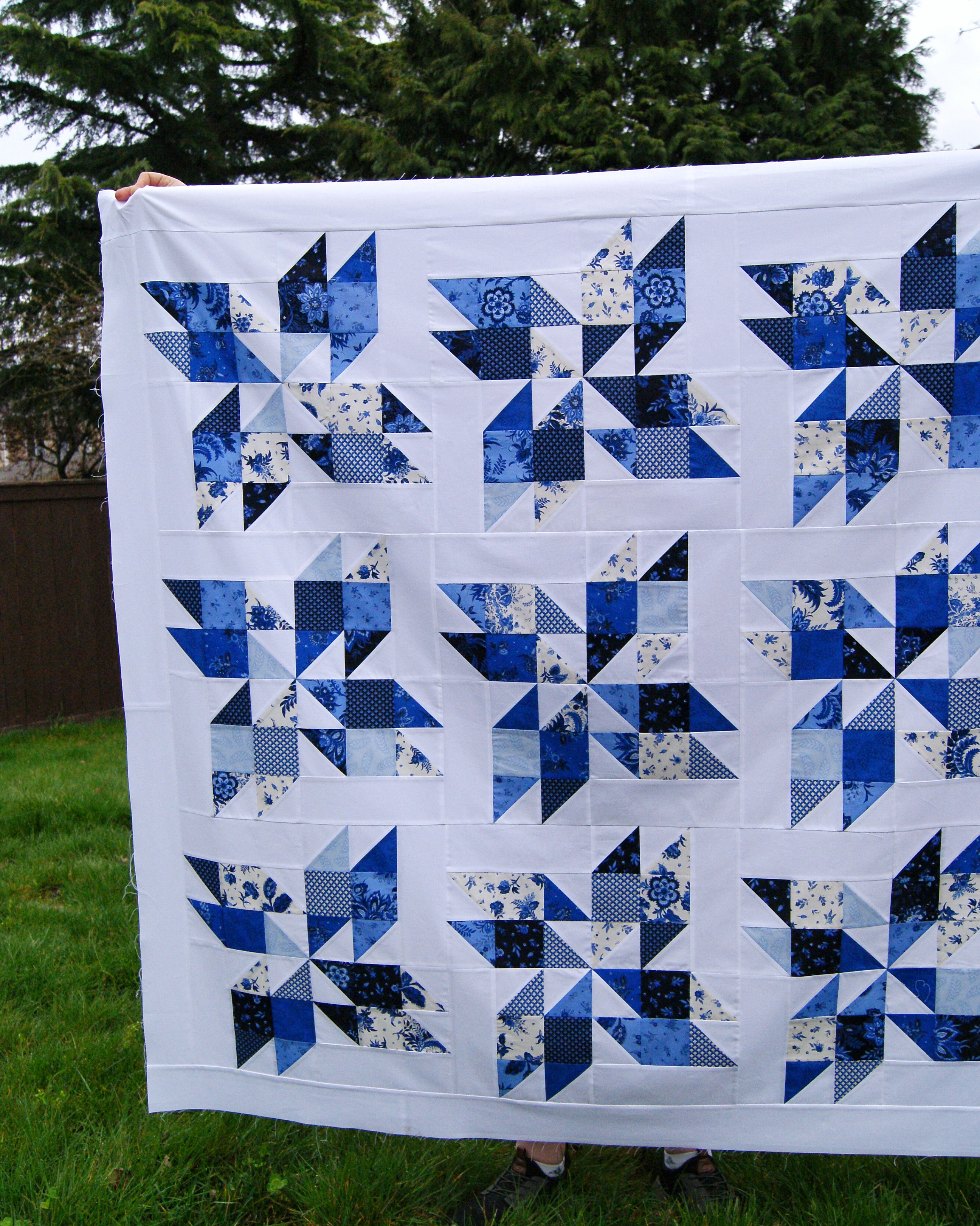
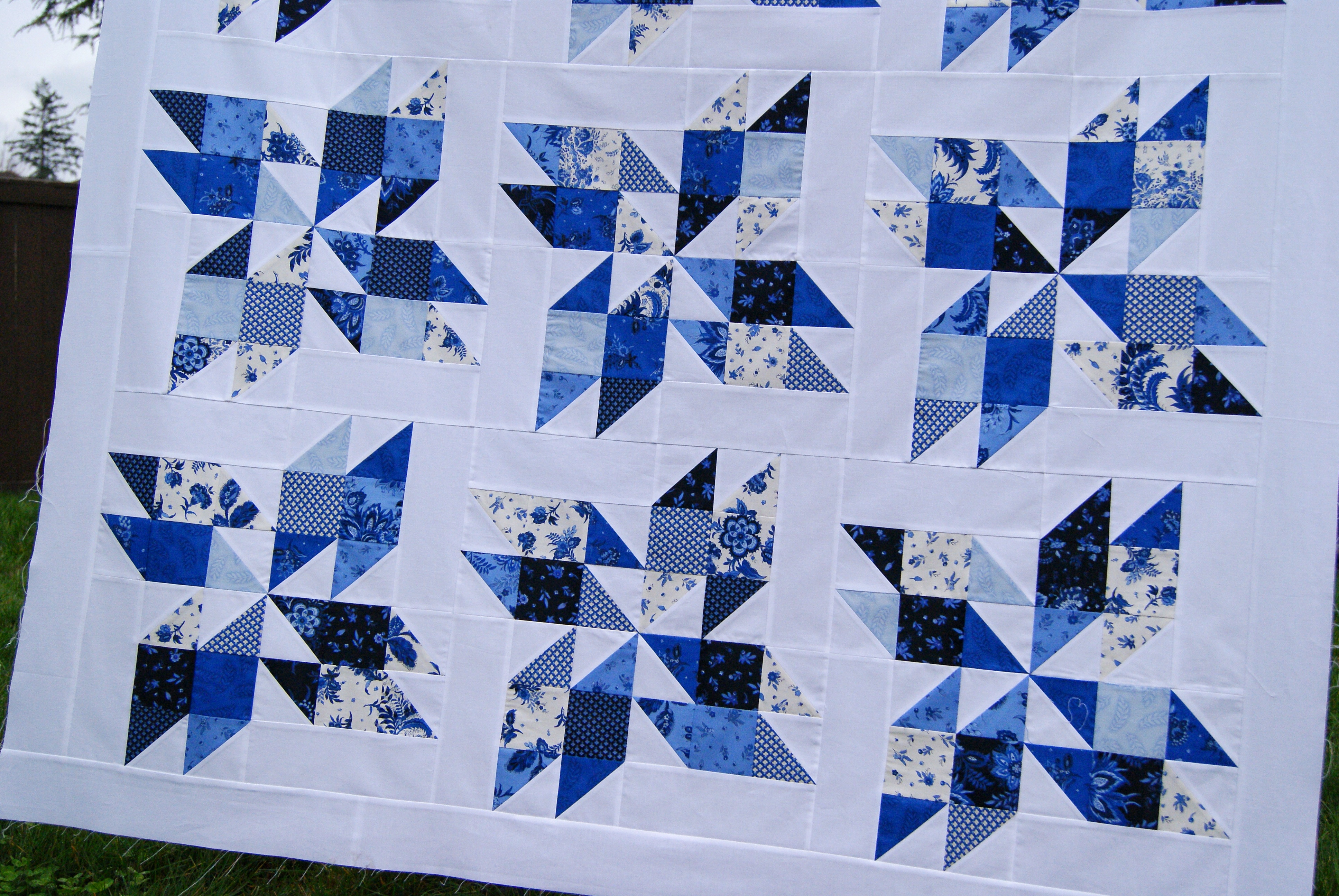
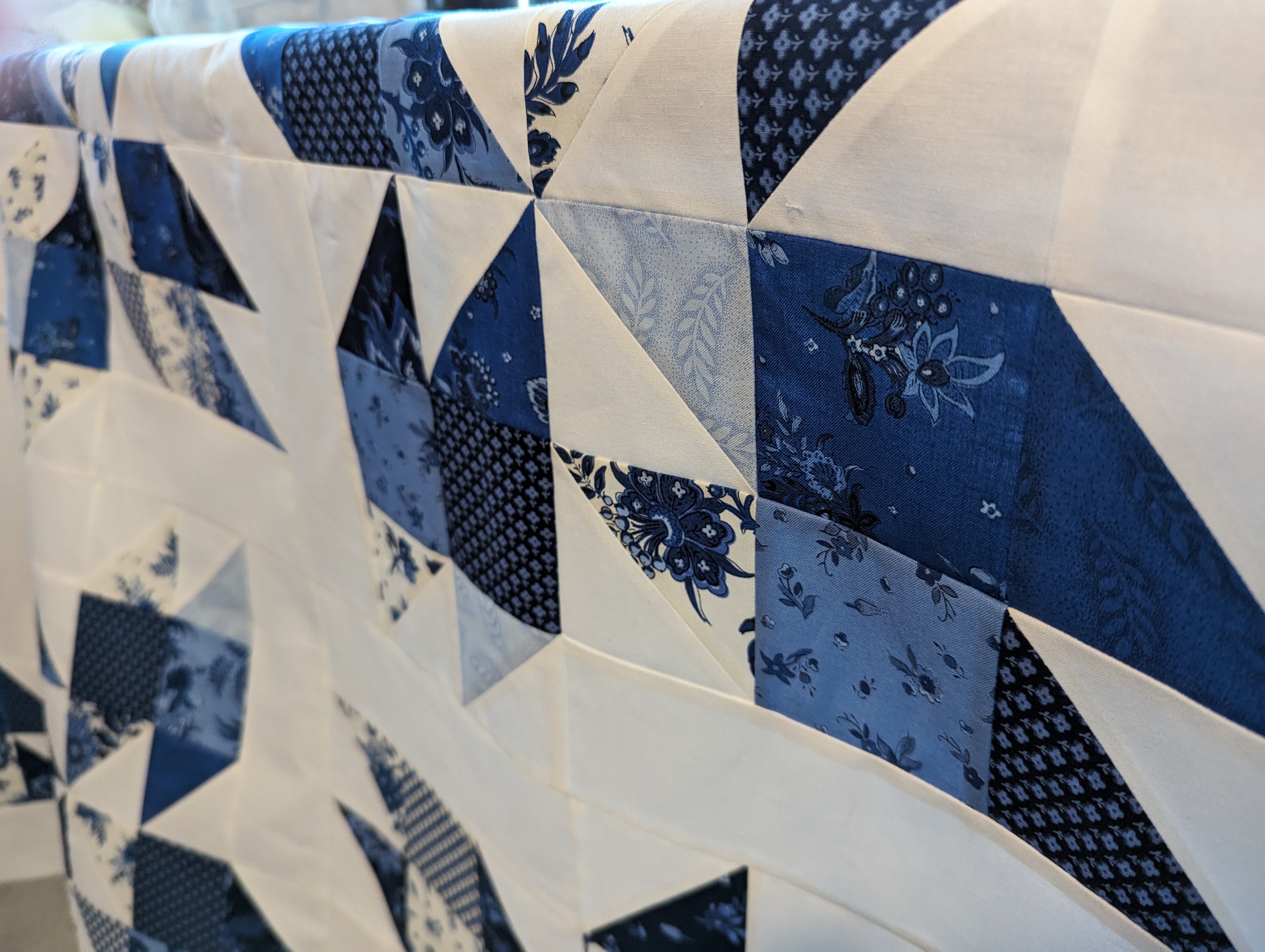
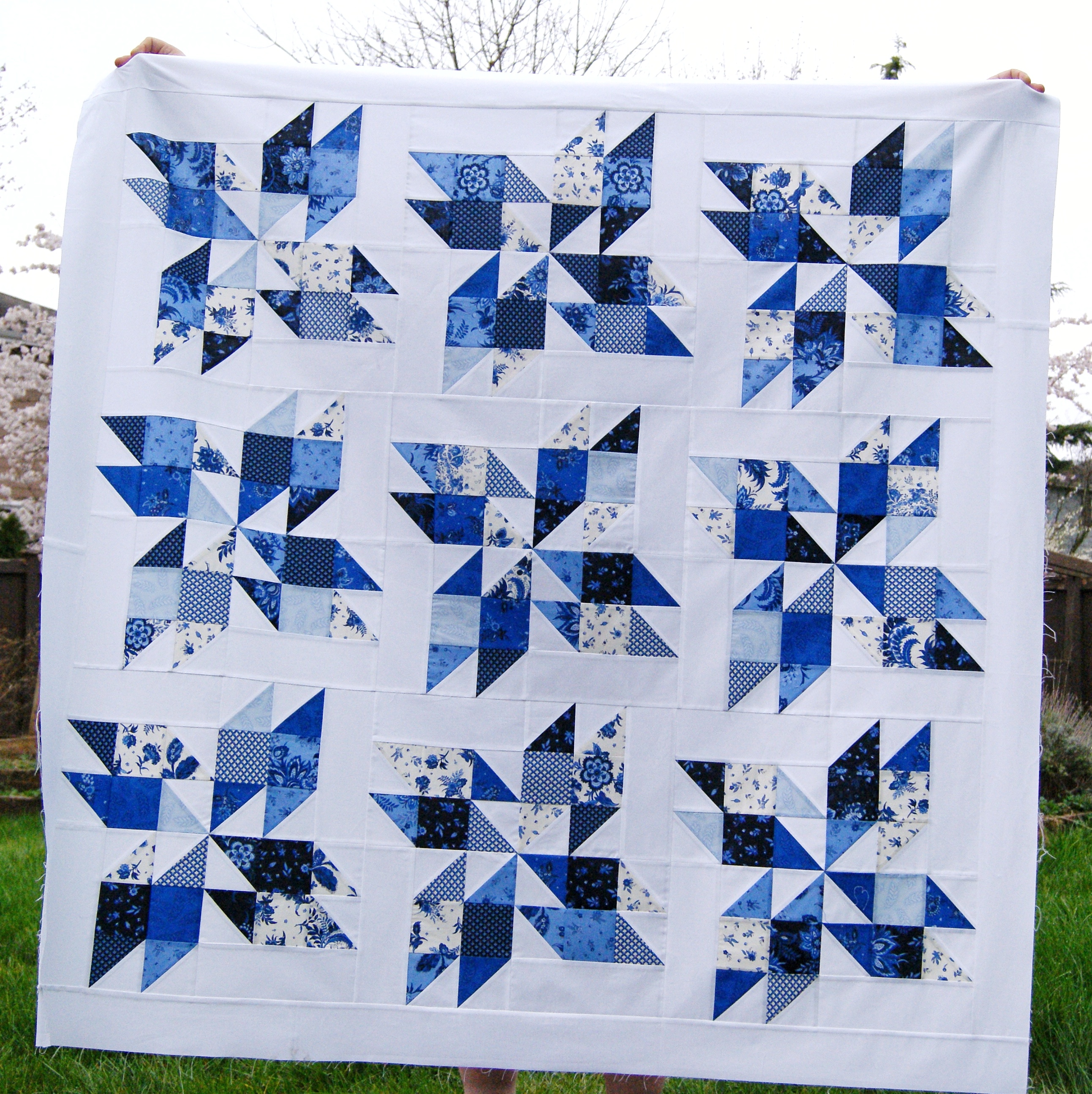
- Finish King David’s Crown quilt for Fat Quarter Shop
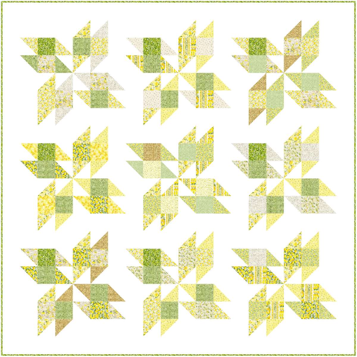
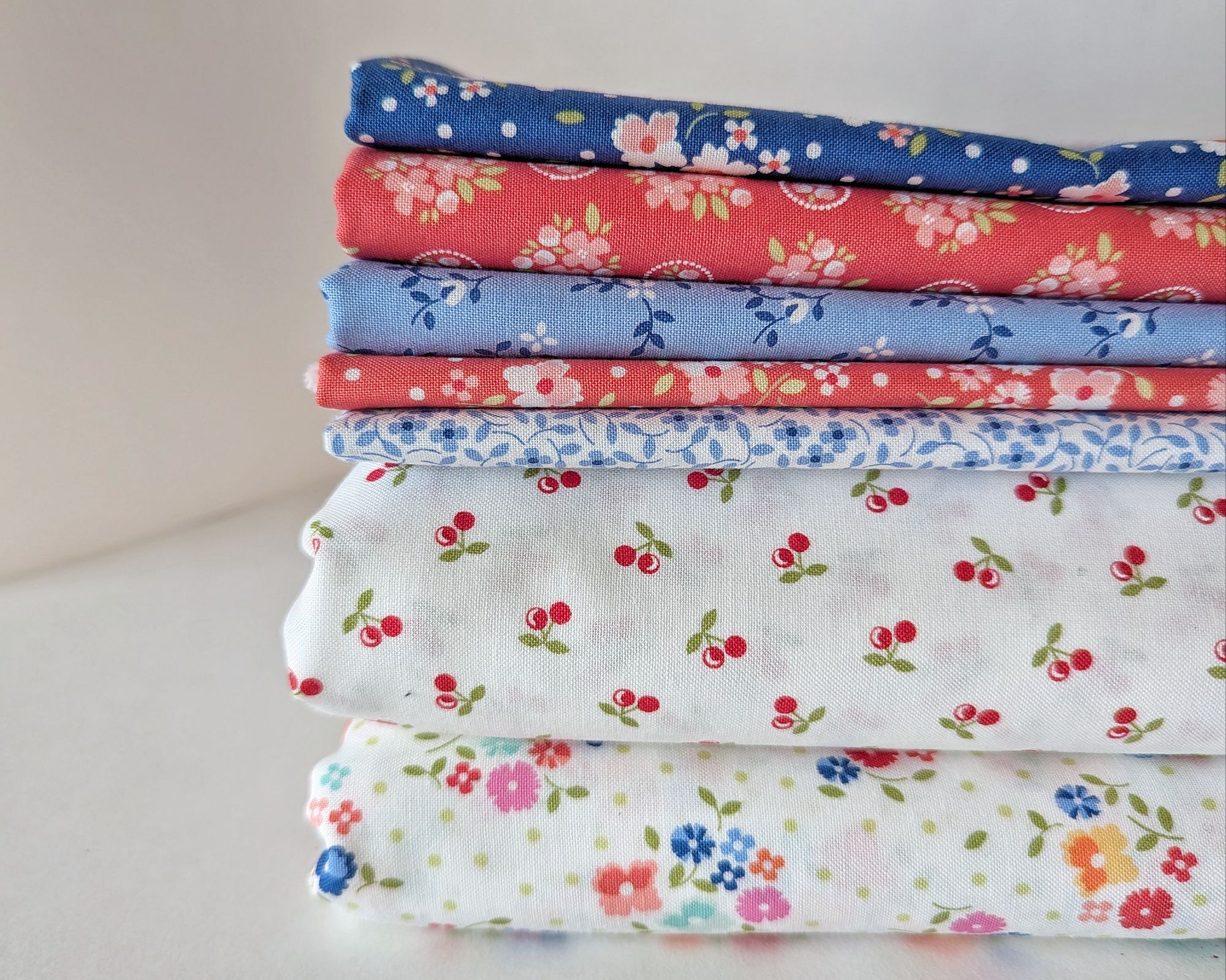
- Begin Star Climber Scrap quilt
- Yarn & Handwork:
- Piscis project
- Finish my Christmas socks
- Begin the Cherry Twilight socks
.

And I’ve learned that it is foolish to plan out further than a quarter at a time, so I’m just going to make do with winter plans at the moment.