
I had fun picking out the fabric for this quilt because there were A LOT of great collections that have come out in the past little while. So many that I actually got a little overwhelmed with my options and decided to poll my Facebook friends on what collection they would choose:

I was really surprised that the winner of the poll was #5: “Antoinette,” by French General for Moda, followed by a tie for second, with only one vote less, of #3 “Honey & Lavender,” by Deb Strain for Moda, and #6 “Lemon Bouquet,” by Timeless Treasures Fabrics.
I had already been leaning towards #1 “French Quarter,” by Maywood Studios because I’ve been slowly morphing my home’s decor towards a blue and white palette, but it really surprised me how few votes the collection got in comparison to the other collections. I love two color quilts and I assumed everyone else did as well. The only other collection to get less votes was #2 with all the reds. Two color quilts are not a favorite amongst the people I know.
So I decided to just mock them all up in the quilt pattern so that people could understand why I was going to go with French Quarter despite it not winning the poll—namely, because the contrast was going to be excellent. I thanked everyone for voting and promised them that I’d show them what each collection looked like once the quilt pattern was released, and so here we are. I present to you, dear friends, what the Layer Cake Latte quilt could have looked like in the different collection options:
#1: French Quarter, from Maywood Studios

#2: Heirloom Red, by My Mind’s Eye from Riley Blake Designs

#3: “Honey & Lavender,” by Deb Strain for Moda Fabrics

#4: “Honeybloom,” by 3 Sisters for Moda Fabrics
I mocked this up with two different background colors because I really liked the blue in the collection.


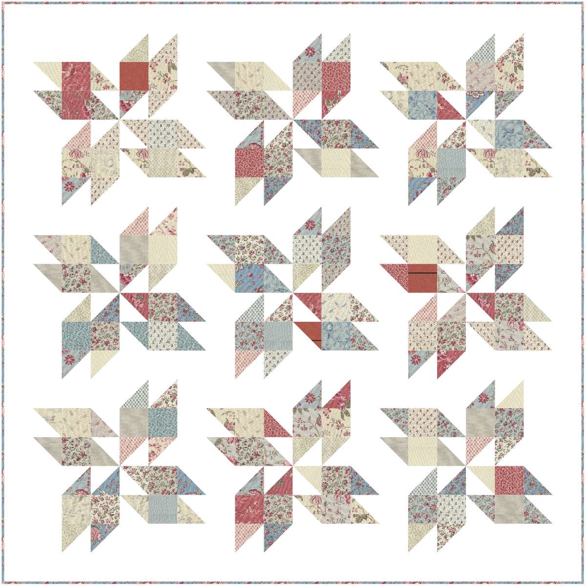
#5: “Antoinette,” by French General for Moda Fabrics
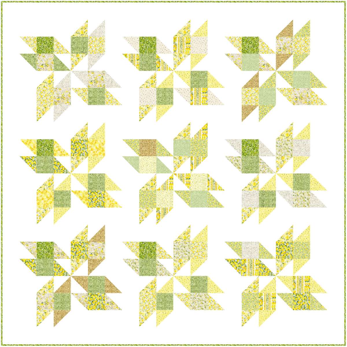
#6: “Lemon Bouquet,” Timeless Treasures Fabrics
I mocked it up with two background colors because I saw the Kona Color of the Year, Mint Julep, and thought it might work well.

I like my quilts to have a fair amount of contrast between the background fabrics and the showcased fabrics, so French Quarter was my ultimate choice, but I did think long and hard about going with Honey & Lavender because I really liked the look of that one as well. I don’t decorate with a lot of purple in my house, so I went with the blue.
But there you go, friends, the visuals that helped me choose my colors. Seeing them mocked up, which fabric collection would you have gone with?

Blue and white, classic and beautiful. Good choice!!
LikeLike